Complete website restyling on the basis of market analysis and the most effective keywords related to the ventilation sector, to optimise and scale search engine rankings.
THE REQUEST
The requirement was well defined: renew the website’s graphic line to convey the freshness and professionalism of the Brand, in total respect of the company values. In addition, the site’s positioning had to be improved, climbing the Google serp.
THE SOLUTION
With this new implementation, we will give Sire the possibility of selling their products online, for further time savings on the part of the customer, who will be able to order directly from the site. Each person will have access to customised price lists for different discounts and catalogues that can be updated in complete autonomy.
We have started a path of growth together and we are certain that we will continue to climb the ranks on Google to the first place, which is what such a reality deserves.
FUTURE DEVELOPMENTS
With this new implementation, we will give Sire the opportunity to sell their products online, which will further save time for the customer, who will be able to order directly from the site. Each person will have access to customised price lists for different discounts and catalogues that can be updated completely independently. We have started a path of growth together and we are certain that we will continue to climb the ranks on Google to the first place, which is what such a reality deserves.
CURIOUS ABOUT WHAT WE CAN CREATE FOR YOU? YOUR POTENTIAL IS JUST WAITING FOR THE RIGHT TOOLS TO EMERGE
Villa Cora: restyling coordinated image and website
Rebranding: logo restyling, corporate image and new website development.
THE REQUEST
Villa Cora manages eleven residences for senior citizens, all located in Piedmont and surrounded by greenery. Operating for over fifty years in this sector, the client felt the need to propose a renewed, more modern and appealing image of the group, in line with its values and the quality of the service offered: safety of the structures, attention and care for guests, ‘family’ environment.
THE [BOLD] SOLUTION
Starting from a careful analysis of the company’s strengths and considering the difficulty in choosing a facility to which to entrust a loved one who was no longer independent, we worked on the best way to convey an image of reliability and to make people perceive the care and warmth necessary for such fragile and yet important guests.
We started by revisiting the logo, which was redesigned focusing on the human aspect. The ‘C’ of Cora has become a stylised Heart to symbolise the love and passion that characterises all the staff at Villa Cora. We therefore designed a new pay-off to reinforce this concept: ‘Heart and Experience‘.
NeroBold took care of the entire coordinated image, including the creation of the presentation leaflets for each of the 11 residences. Each image was carefully chosen to communicate all the professionalism, attention and dedication that the Villa Cora residences are able to offer.
Thanks to the restyling work, the website has also been completely revamped, focusing on a modern design and smoother navigation, giving wide visibility and prominence to the company values and to each residence. Finally, we edited the videos for each residence, to give a more direct message and appeal to the user.
This project was realised in partnership with Nebula Strategy
Erica Ambiente: restyling coordinated image and website
Restyling of the corporate image, starting with an analysis of the sector and a study of the values to be communicated, makeover of the logo and website.
THE REQUEST
Erica Ambiente is a solid company that has been operating in the environmental services sector for over thirty years. Constantly looking for advanced solutions, it no longer recognised itself in the image it offered to its customers and partners and needed to modernise its corporate image.
The objective: to ‘freshen up’ the logo and renew the website in order to better communicate their innovative soul, values and projects. Finally, adapt all the other communication elements to the new graphics.
THE [BOLD] SOLUTION
Redesigning a logo is an essential aspect in the rebranding process of a company; it is necessary not to lose those elements from the past that made it memorable to customers and partners.
We therefore decided to keep the green colour and the graphic element of the leaf, we left it integrated in the letter ‘e’ and designed a ‘stylised’ version with more modern lines. In addition, we designed a payoff: ‘Value for the environment’ to reinforce the message and give the logo more punch and personality. In parallel with the creation of the corporate image (including agendas, leaflets, window stickers and company gadgets), we took care of the restyling of the website.
After an SEO analysis carried out by our partner DIGITOOLS, we reorganised the content, highlighted the Services offered and the Research and Development area, created a Blog, and took great care in choosing the photographs best suited to the new image chosen for Erica.
This project was realised in partnership with Digitools
Corporate rebranding with the creation of the logo and corporate identity.
THE REQUEST
A21, a holding company offering a wide range of automotive services, requested our advice and expertise to carry out a rebranding project.
THE [BOLD] SOLUTION
The rebranding project carried out by NeroBold for A21 led to the creation of a new corporate identity, with the aim of creating a modern corporate image in line with the automtive sector.
During the rebranding process, NeroBold conducted extensive research into the fonts, colors and images to be used, with the aim of creating graphic assets that could effectively communicate the company’s values and products.
The structure and style of the new logos echo a technical, very clean font, just as for the colors, tones were chosen that easily draw the user’s attention. We thought of the logotype of the A21 holding company by going to encompass the two souls of the company – Caresafe and Autosicura – which also live independently, taking up only their portion of the logo, i.e., half of the car.
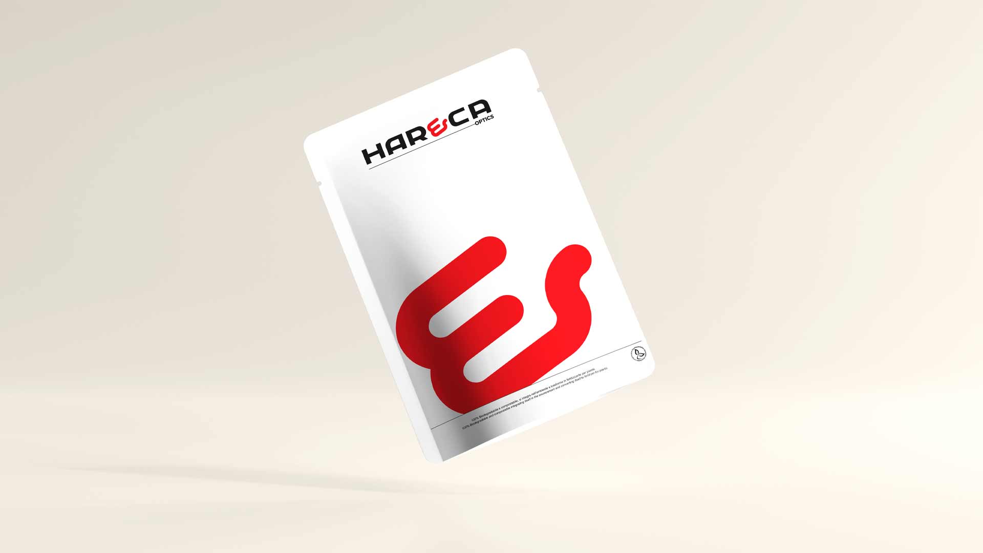
Corporate image restyling in the cable and cabling sector
THE REQUEST
Har&Ca operates in a highly competitive and innovative sector, serving several European and Asian Markets. It needed to make its logo more effective and incisive, in line with the leadership position it is gaining on the market and with the company’s international mentality.
Every other communication element had to follow suit.
THE [BOLD] SOLUTION
We started from the industry study to empathise with the Euro-Asian industrial mentality. We wanted to express the high quality of Har&Ca’s products, combined with its total willingness to assist customers, conveying its values of Proximity, Professionalism and Reliability.
We therefore developed a new logo that followed these requirements, coordinated with the other corporate communication content: forms, business cards, presentation, newsletter template. We also coordinated as art director the development of the institutional video and photo shoot.
Restyling grafico del logo per azienda di automazione industriale.
La richiesta
Il logo dovrebbe riflettere i valori aziendali. Semplice da dire, difficile da applicare per molti colossi industriali.
Negli anni la natura aziendale cambia, adattandosi al mercato. OMC Valves non è più la stessa azienda nata nel 1976, ha acquisito esperienza, nuove competenze ed un know-how invidiabile, insomma OMC si è evoluta. Il suo logo non l’aveva ancora fatto.
La [BOLD] soluzione
Come sempre abbiamo iniziato il nostro lavoro dalle fondamenta: studio di Azienda, Mercato e Clienti. Quello dell’automazione industriale è un settore con cui lavoriamo spesso e questo ha velocizzato l’intero processo.
Il nuovo logo rispetta i colori autentici del Brand ma il suo aspetto appare nettamente più moderno, elegante e d’impatto. I valori di sempre incontrano lo sviluppo tecnologico che l’azienda ha saputo concretizzare negli ultimi anni.
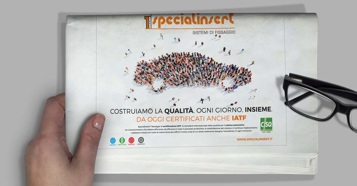
Specialinsert: trade fair stands and advertising pages
Stand design, graphic design of trade fair posters and advertising pages
THE REQUEST
Trade fair stand design is an important and very complex activity: it requires creativity, strategy, quality and experience. Having a stand with attention to detail is essential to be able to communicate effectively with possible customers at the trade fair.
Specialinsert is a company that is present in the world of fasteners and boasts a series of proposals that range from threaded tubular inserts to bushings for plastic materials, from threaded inserts to self-tapping bushings, from inserts for wood to breakstem rivets and ¼ turn fasteners: 100% certified Made in Italy production.
THE SOLUTION
NeroBold was commissioned to design the Specialinsert stand at Marmomac and create the institutional and product advertising pages, published in trade magazines such as Italian Fasteners and newspapers such as Il Sole 24 Ore. Nothing is left to chance, from design to signage, to emphasise the company image and ensure that the message hits the mark.
Logo design; production of business cards, pads, folders, flyers; application of shop signs
THE REQUEST
Milanino Agency approached us to take on the challenge of creating an ad hoc coordinated image. By studying the logo we then arrived at the final design. The client, fully satisfied with the work done, commissioned us to produce the business cards, notepads, file folders and flyers. Finally, in order to achieve a complete makeover, NeroBold produced and applied the shop signage to achieve greater customer recognition.
THE SOLUTION
Creating an effective corporate identity for your company brings significant benefits. Uniformity and stylistic continuity help a brand to be remembered, to be imprinted in the minds of the beholder and, if truly effective, to become a cult. However, the corporate image is not only visual, consistency must also be found in the textual part.
Client: Besana Moquette Sector: Furniture, Design Sito Web: www.besanamoquette.com Workmanship: Graphic design and layout, text realisation, English translations
Non è stato possibile salvare la tua iscrizione. Si prega di riprovare.
webpilot La tua iscrizione è avvenuta con successo.
Scopri come l’AI può davvero aiutarti: scarica la guida gratuita
Compila il form e ricevi subito la guida che ti svela come risparmiare tempo, semplificare il lavoro e migliorare i processi con l’intelligenza artificiale, senza complicazioni e senza perdere tempo.


