Villa Cora: restyling coordinated image and website

Case Study

Villa Cora: restyling coordinated image and website

Rebranding: logo restyling, corporate image and new website development.

THE REQUEST

Villa Cora manages eleven residences for senior citizens, all located in Piedmont and surrounded by greenery.
Operating for over fifty years in this sector, the client felt the need to propose a renewed, more modern and appealing image of the group, in line with its values and the quality of the service offered: safety of the structures, attention and care for guests, ‘family’ environment.

THE [BOLD] SOLUTION

Starting from a careful analysis of the company’s strengths and considering the difficulty in choosing a facility to which to entrust a loved one who was no longer independent, we worked on the best way to convey an image of reliability and to make people perceive the care and warmth necessary for such fragile and yet important guests.

We started by revisiting the logo, which was redesigned focusing on the human aspect. The ‘C’ of Cora has become a stylised Heart to symbolise the love and passion that characterises all the staff at Villa Cora. We therefore designed a new pay-off to reinforce this concept: ‘Heart and Experience‘.

NeroBold took care of the entire coordinated image, including the creation of the presentation leaflets for each of the 11 residences. Each image was carefully chosen to communicate all the professionalism, attention and dedication that the Villa Cora residences are able to offer.

Thanks to the restyling work, the website has also been completely revamped, focusing on a modern design and smoother navigation, giving wide visibility and prominence to the company values and to each residence.
Finally, we edited the videos for each residence, to give a more direct message and appeal to the user.

This project was realised in partnership with Nebula Strategy

Erica Ambiente: restyling coordinated image and website

Case Study

Erica Ambiente: restyling coordinated image and website

Restyling of the corporate image, starting with an analysis of the sector and a study of the values to be communicated, makeover of the logo and website.

THE REQUEST

Erica Ambiente is a solid company that has been operating in the environmental services sector for over thirty years. Constantly looking for advanced solutions, it no longer recognised itself in the image it offered to its customers and partners and needed to modernise its corporate image.

The objective: to ‘freshen up’ the logo and renew the website in order to better communicate their innovative soul, values and projects. Finally, adapt all the other communication elements to the new graphics.

THE [BOLD] SOLUTION

Redesigning a logo is an essential aspect in the rebranding process of a company; it is necessary not to lose those elements from the past that made it memorable to customers and partners.

We therefore decided to keep the green colour and the graphic element of the leaf, we left it integrated in the letter ‘e’ and designed a ‘stylised’ version with more modern lines. In addition, we designed a payoff: ‘Value for the environment’ to reinforce the message and give the logo more punch and personality.
In parallel with the creation of the corporate image (including agendas, leaflets, window stickers and company gadgets), we took care of the restyling of the website.

After an SEO analysis carried out by our partner DIGITOOLS, we reorganised the content, highlighted the Services offered and the Research and Development area, created a Blog, and took great care in choosing the photographs best suited to the new image chosen for Erica.

This project was realised in partnership with Digitools

HAR&CA: logo restyling and coordinated image

Case Study

HAR&CA: logo restyling and coordinated image

Corporate image restyling in the cable and cabling sector

THE REQUEST

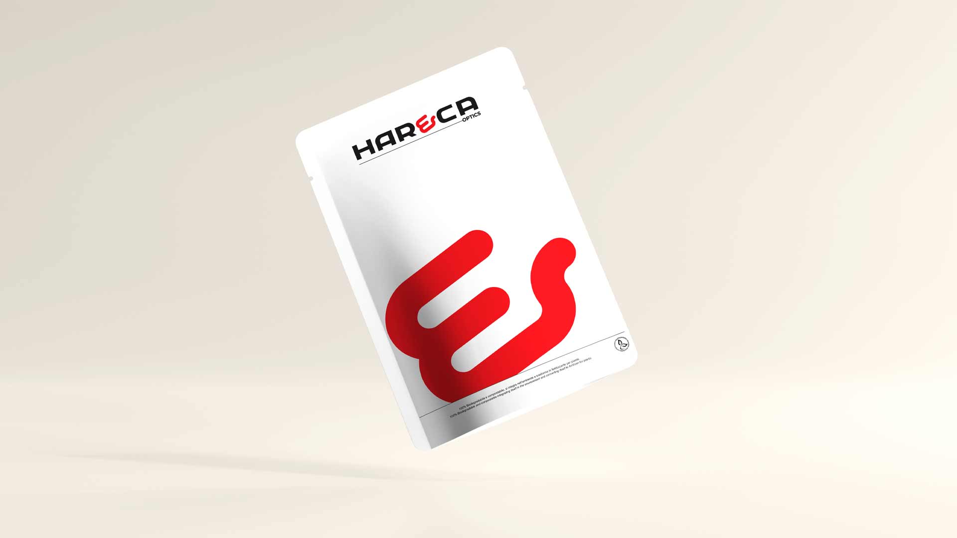
Har&Ca operates in a highly competitive and innovative sector, serving several European and Asian Markets. It needed to make its logo more effective and incisive, in line with the leadership position it is gaining on the market and with the company’s international mentality.

Every other communication element had to follow suit.

THE [BOLD] SOLUTION

We started from the industry study to empathise with the Euro-Asian industrial mentality. We wanted to express the high quality of Har&Ca’s products, combined with its total willingness to assist customers, conveying its values of Proximity, Professionalism and Reliability.

We therefore developed a new logo that followed these requirements, coordinated with the other corporate communication content: forms, business cards, presentation, newsletter template. We also coordinated as art director the development of the institutional video and photo shoot.

This project was realised with Zucchi39

Betacryl: landing page development

Case Study

Betacryl: landing page development

Landing page development in the solid surface sector

THE REQUEST

BTS needed to communicate its commercial offer in the best possible way. No point being unique if you can’t show it to your customers. Two landing pages were needed that were intuitive enough to be persuasive and reassuring, removing any doubt from the visitor’s mind.

THE [BOLD] SOLUTION

After years and years of testing, we realised how to maximise the potential of B2B realities.

We always start by studying the Product and the Market, then analysing the Target.

The result? Two landing pages created with WordPress, the world’s most popular platform for websites, that look professional and intuitive.

The launch information was re-organised, the graphics created from scratch and the brand guidelines respected.

We set up optimised Facebook campaigns to reach target people and companies that could directly benefit from BTS products.

SOCIAL CAMPAIGNS

Total post coverage
0

SOCIAL CAMPAIGNS

Total contacts
0

SOCIAL CAMPAIGNS

Acquired contacts
0

SOCIAL CAMPAIGNS

Click on link
0 €

This project was realised in partnership with Nebula Strategy.

Specialinsert: video tutorial 3D

Case Study

Specialinsert: video tutorial 3D

Video tutorial sulla posa dei sistemi di fissaggio meccanici

La richiesta

Specialinsert ha sempre puntato tutto sulla cura dei dettagli. Sono proprio i dettagli ad averla resa una delle aziende leader nei sistemi di fissaggio. Vuole comunicare il suo valore aggiunto e soprattutto aiutare tutti i clienti e collaboratori anche da remoto.

Come?

Con un video tutorial chiaro e completo, che li guidi passo-passo nella scoperta del prodotto, mostrandogli il modo per evitare perdite di tempo ed errori di montaggio.

La [BOLD] soluzione

Iniziamo dallo studio del prodotto e del Mercato in cui Specialinsert opera.

Ne troviamo i punti di forza, esaminiamo domande e problemi dei suoi clienti e iniziamo a sviluppare soluzioni. Il nostro obbiettivo è semplice: creare un Tutorial comprensibile a chiunque, anche ai non addetti ai lavori. Non dev’esserci spazio per i dubbi. Facciamo una proposta all’Azienda che prevede uno script chiaro e completo, un’animazione grafica dedicata ed un video editing completo.

Linea Grafica: digital marketing

Case Study

Linea Grafica: digital marketing

Sviluppo landing page, creazione campagne social,realizzazione e invio DEM

La richiesta

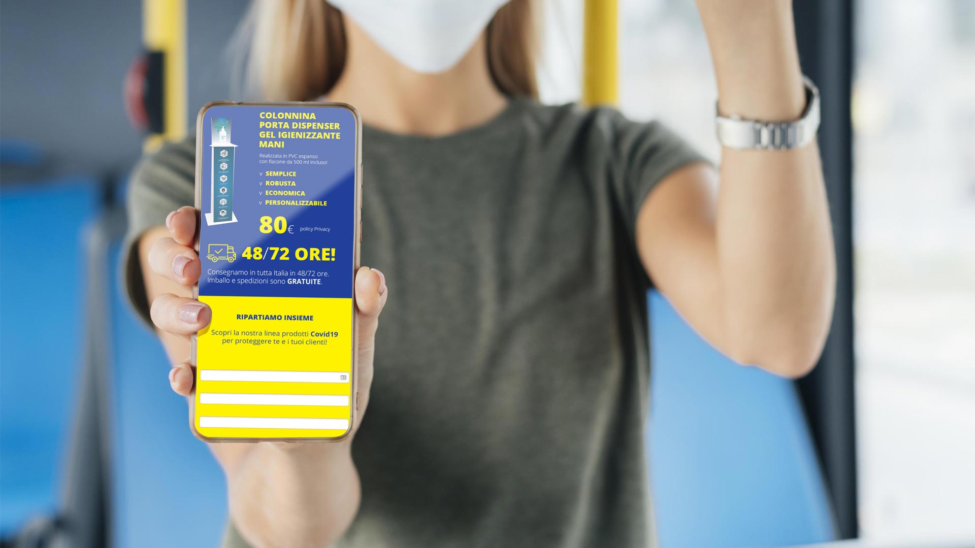
Linea Grafica si è rivolta a noi per promuovere soluzioni sviluppate ad hoc per il periodo Covid (colonnina igienizzante ed altri materiali), in particolare per estendere il suo business nella vendita online.

La [BOLD] soluzione

Gli obbiettivi cambiano, le esigenze evolvono, l’unica costante resta il confronto col cliente,
sempre! Piccolo o grande che sia, ogni progetto per noi è al primo posto.
Non avendo il cliente, un sito dinamico, abbiamo sviluppato la landing page in HTML5 per un’immediata e semplice integrazione con la loro piattaforma.
L’obbiettivo è chiaro: acquisire nuovi lead, trasmettergli il potenziale delle soluzioni di Linea Grafica e generare conversione. Oltre alle nuove landing page per i prodotti di punta, creiamo delle campagne targhetizzate sui social che puntino al sito web. L’invio di DEM, di cui abbiamo attivato l’account e curato l’invio, ci permette di raggiungere ancora più persone in target.

Newsletter
Tasso apertura
0 %
Newsletter
Percentuale di click
0 %
Campagne social
Contatti acquisiti
0
Campagne social
Costo per singolo contatto
0 €

GBTech: lead generation campaign

Cash Study

GBTech: lead generation campaign

Lead generation campaign with landing page, Facebook ADV campaign

THE REQUEST

GBTech has chosen NeroBold to implement a digital marketing project promoting a facial recognition product.
The purpose of the project is to gather contacts in target audience located throughout Italy who are interested in their innovative product.

THE [BOLD] SOLUTION

We relied on WordPress, as the platform is already used by the client for its website, to develop a landing page presenting all the features of the product.

We launched a social campaign targeting a very specific audience, reaching about 25.000 users across the peninsula.

Landing pages and social campaigns offer many advantages to companies promoting their products online, including a high conversion rate, the ability to capture users’ attention, and to reach a wider and more specific audience.

Social campaigns

People reached (15 days)
0

Social campaigns

Link clicks
0

Social campaigns

Contacts acquired
0

Social campaigns

Cost per contact
0 €
Non è stato possibile salvare la tua iscrizione. Si prega di riprovare.
webpilot La tua iscrizione è avvenuta con successo.

Newsletter

Iscriviti alla nostra newsletter, ti promettiamo che non ne rimarrai deluso. ANCHE NOI ODIAMO LO SPAM

Utilizziamo Brevo come nostra piattaforma di marketing. Inviando questo modulo, accetti che i dati personali forniti vengano trasferiti a Brevo per essere elaborati in conformità con la Privacy Policy di Brevo.

Saresti interessato in altri servizi: